TMOS

Mobile app,
for delivery riders

The Challenge

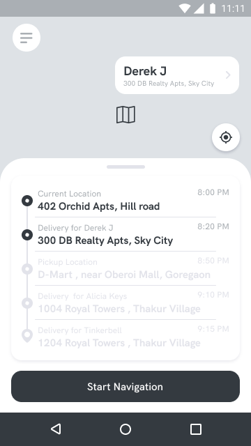
TMOS wanted a mobile app designed for the latest addition to their ecosystem. This app would be used by delivery boys across the cities of operation to accept orders and then deliver products to the locations assigned to them. With a wide variety of Delivery apps on the app stores, It was a huge priority to stand out among them and get as many users on board as possible.

My Role

Product Designer

TMOS Delivery Agent : payments page

The most advanced
delivery platform on the market.

To filter out the low-performing riders, we built an algorithm to help promote riders who consistently perform well. We would offer them better compensation and steady orders. The addition of my custom game physics and leveling system boosted the performance of our delivery agents.

So, how did I do it ?

Scroll down to see my design process.

Innovate new ways to conduct user research during a pandemic

Strategize solutions to
increase user engagement
and incentivize customer loyalty

Add the magic of great UX...

with a pinch of Gamification

Competitive Analysis

Studying the
market landscape to find customer pain points.

Swiggy Delivery App

"Automatically logged out of the app as soon as I left my zone even though I was there to deliver food."

"App does not work with battery saver mode. We use our phones the entire day and this needs to be fixed asap."

"I wish Swiggy offered an option for payouts in the middle of the week."

Zomato Runnr App

Google searches, Glassdoor reviews, and YouTube videos all pointed the fact that the Runnr app is good for the most part.
However, their business model makes it almost impossible to achieve targets and get incentives. They also have a local leaderboard system in place, which makes the delivery riders compete against each other to rank up.

Dunzo

"The offered price per task has gone down although the gas prices have gone up significantly. The incentive plan structure makes it impossible to achieve."

"Extremely low payouts for longer distances compared to competitor apps."

"There's no option in the app to respond to the customer, only the customers can type in the chatbox."

Uber Eats

"You can easily accidentally accept an order due to the button being located in the lower half of the screen."

"The Navigation is horrible, slow and drops out frequently. After accepting the delivery, the info screen goes off."

"Need more income and steady boosts. The app could use a screensaver as my older phone had the uber logo burned into the screen."

User personas

Market segmentation to diversify our interview groups.

User research

User research from interviews, observations, YouTube vlogs, app store reviews and more...

Most People

Are unhappy with the current delivery platforms in India.

Are not able to earn a decent living staying loyal to one app.

Feel there is a lack of transparency regarding the payouts and amounts charged to customers.

Feel demotivated about using delivery platforms.

Feel the targets to achieve incentives are impossible to reach.

Are associated with multiple delivery apps and switch based on rewards.

Are reliant on delivery platforms full time to support their families.

Use Android devices

Overwhelming Majority

Common Goals

Be Rewarded for brand loyalty and good service.

Choose when to withdraw the floating cash.

Work according to their schedules and in the zones they want to.

Maximize their earning potential.

Being logged out when they move out of the assigned radius.

Lack of transparency or information before accepting an order.

Seemingly impossible to achieve incentive targets.

Mobile battery and data intensive.

Common
Pain-points

User research

User Persona,
consolidating research findings.

Synthesizing research insights

Translating needs and insights,
into Point of view and How might we statements.

How might we
earn a rider's loyalty and build a system that motivates them
to continue doing good work?

Synthesizing research insights

Balancing UX with business goals and technical constraints.

Information Architecture

Mapping out the information architecture for the platform.

Interaction Design

Optimizing the interactions for our target customers.

Creating an interaction design map involved me planning out the prominent tasks that the user might want to accomplish with the app. I then created a flow of events that are intuitive and break down the complex steps into smaller simple to understand steps. I also had to keep in mind that most of our users did not come from a strong educational background and hence it was crucial to optimize the app for them.

Wireframing

Wireframes of some screens

Home Screen

The main screen after login. Once can go online to start accepting orders from any location. Once an order is ready to be picked up, the rider will get a popup.

Order Screen

The order screen pops up when there's a delivery request nearby. The slide to accept button reduces the chances of a rider accidentally accepting an order.

Order Progress

The AI behind the platform, maps the shortest path and maximizes the number of orders a rider is able to process. Thereby reducing the number of trips and maximizing their earning potential.

Delivery Verification

After a rider has delivered the items, they need to verify the delivery using either an OTP or a photograph of the delivered parcel
(in some cases).

OTP Verification

Once the order is delivered to a customer, the rider would require to request for an OTP from the customer to confirm that the delivery was successful.

Trip Earnings

All the trip earnings of the rider are broken down into categories for transparency. Riders are now able to see the time spent on the task and their earnings. They're also rewarded TMOS Points which can be redeemed for in-app goodies.

Check out the
Product Promo!