


Synapse Events is a Mumbai based event management firm. Having extensive expertise in the area, the co-founders wanted to start their firm, and hence Synapse was born. The firm mainly focuses on wedding planning.

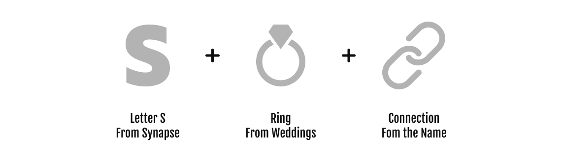
Since the clients' central area of focus was weddings and receptions, I made sure to draw inspiration from such events. The logo had to be minimal and straightforward and convey my client's work area without their customer having to take a second look. An ideal symbol for this was the Wedding Ring which directly explains the concept.


I try to make use of the Golden Ratio circle to construct logos whenever possible. This is believed to make the logo visually balanced and aesthetically pleasing.

Creating a Brand mark is just half the battle. It’s also essential that you balance it with the text. I tried to make sure that the two are visible and, at the same time, not too stretched out. I carefully fit the tagline under the Brand Name. The font choice was “Made Saonara,” it was serif, looked elegant, and luxurious, just what the client asked for.

The color chosen was a pastel shade of nude. It represents elegance and modesty. Additionally, according to color psychology, nude shading is straightforward, real, and authentic. It identifies with the dedicated and dependable. It is arousing, delicate, and warm, overwhelming one of a sentiment of smoothness and comfort. It shrouds the earth. Paired with a complementary shade of brown, it was ready to be used in the logo.


